
Objective: Rebrand Rideaway Adventures (Cape Cod – surf & bike rental lifestyle company) and design a flagship store experience along with launch apparel to reflect the brand’s nature/adventure DNA.
My role / contribution: I led the brand research, logotype and visual identity design, interior flagship store design, and apparel collection collaboration — handling both creative strategy and hands-on
design execution.
design execution.
Key highlight / impact: Balanced boutique design with rental utility and family-friendly sensibility, establishing a refreshed brand expression that supported both lifestyle resonance and business growth in the adventure-tourism segment.
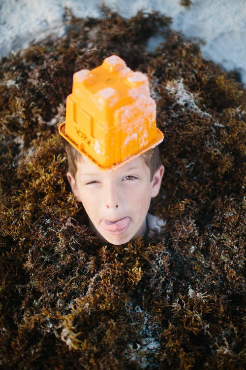
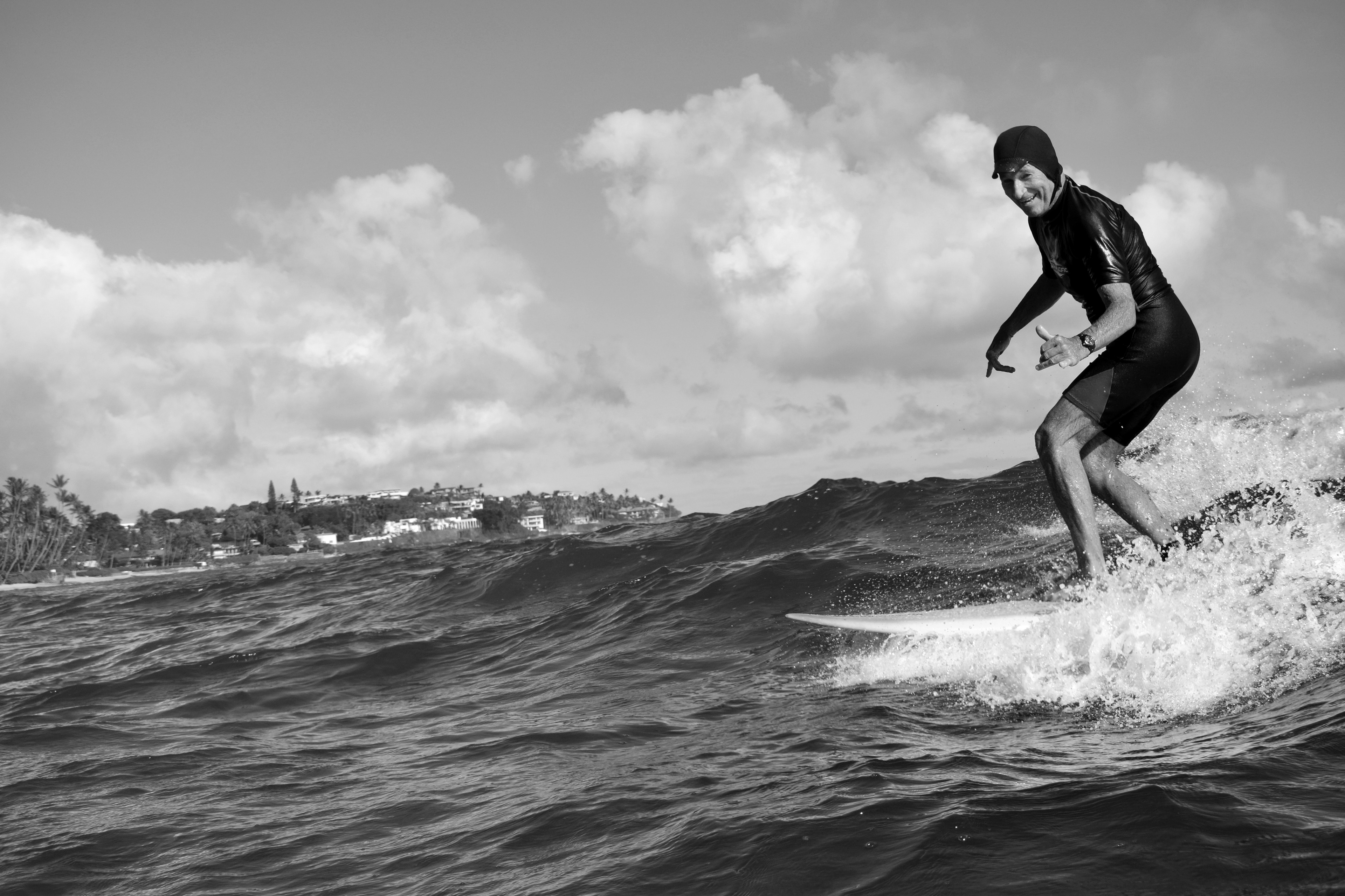
Rideaway Adventures is on a mission - to turn every one of its customers into an advocate for nature. How? By getting people of all ages and skill levels outdoors and introducing them to kayaking, biking, surfing, and stand up paddle-boarding.
Objective
Objective
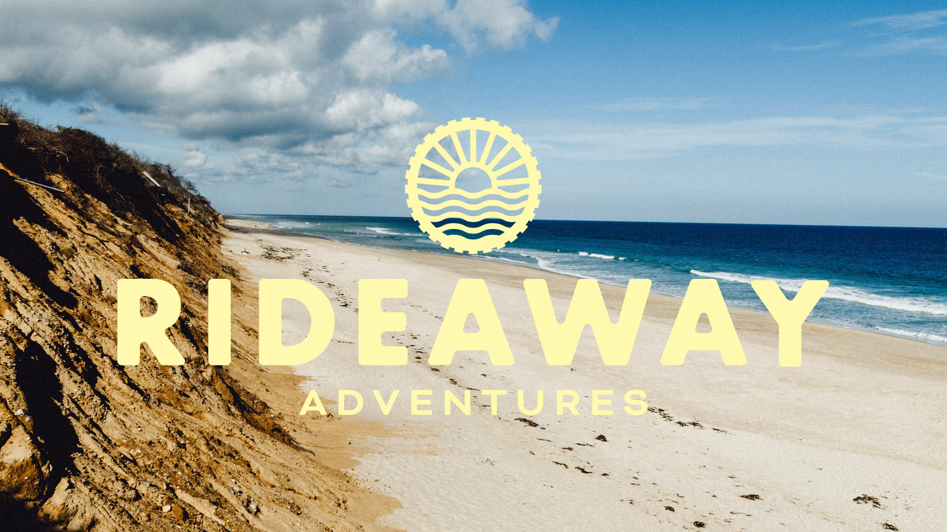
To rebrand Rideaway as the premier nature-based adventure company of Cape Cod. They've been in business for 15 years and need an identity to carry them through the next 100.
Research
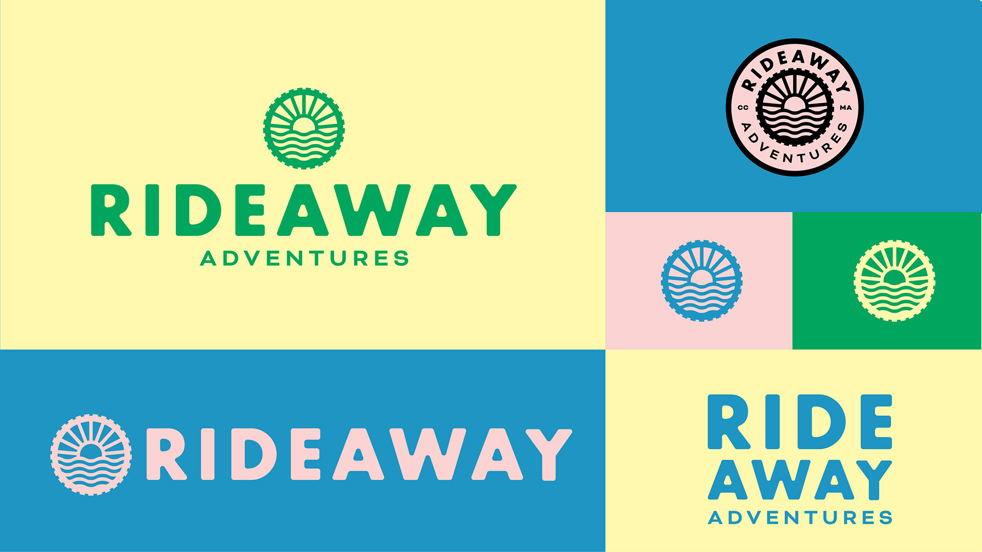
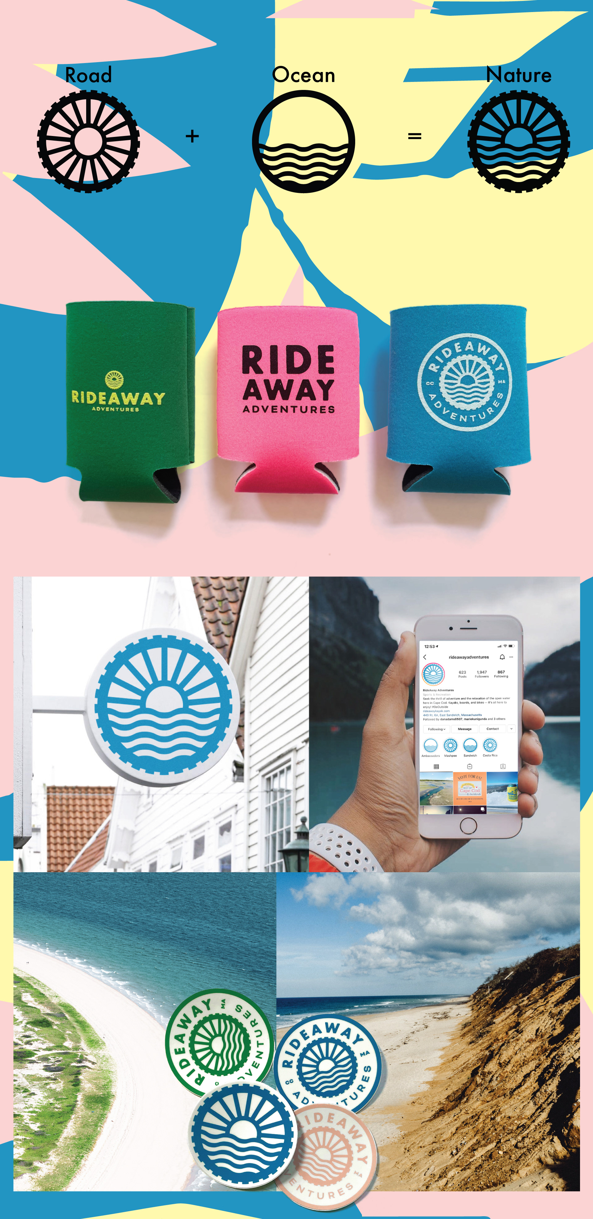
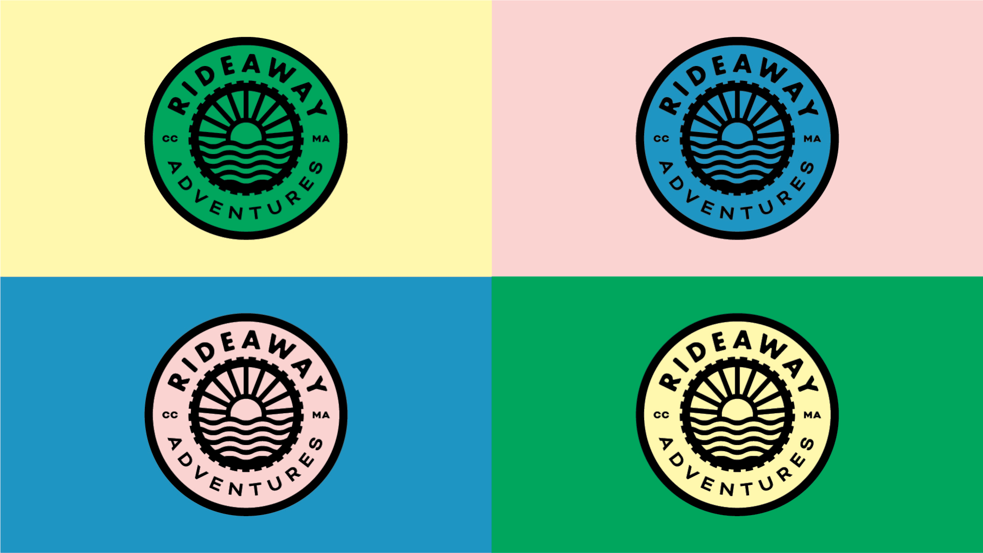
Through conversations around the personality of the brand, we identified key traits that were unique to Rideaway. The new logo needed to be bold yet approachable, adventurous but responsible.
It's not about "extreme sports."
It's about making outdoor sports accessible to all.
It's not about "extreme sports."
It's about making outdoor sports accessible to all.
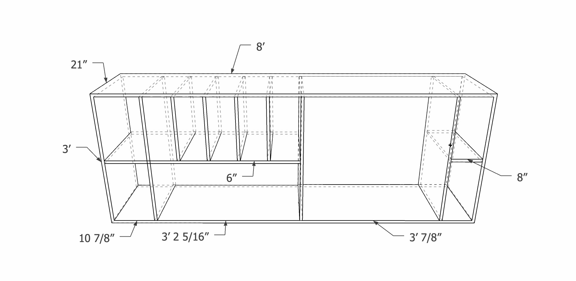
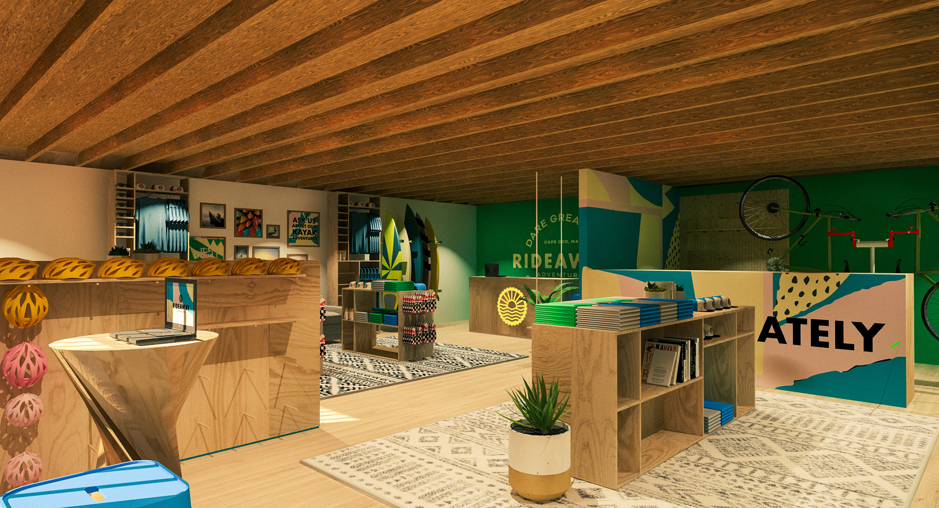
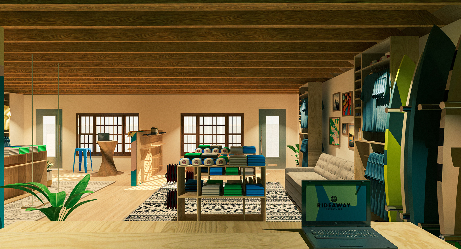
Retail & Interior Design
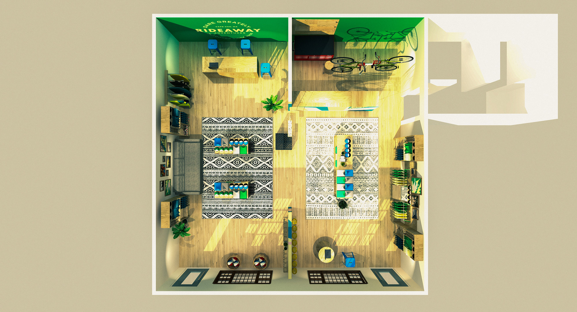
Then came time to bring the new flagship store to life. A warm, natural, and inviting space inspired by the surf shops of the West coast while remaining true to it's East coast roots. Natural wood, colorful textures, and product assortments that tell the story of a day-in-the-life with Rideaway Adventures.
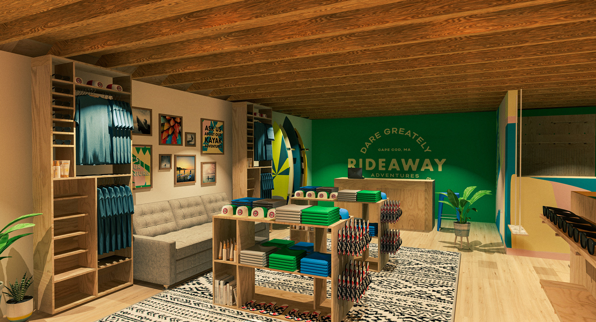
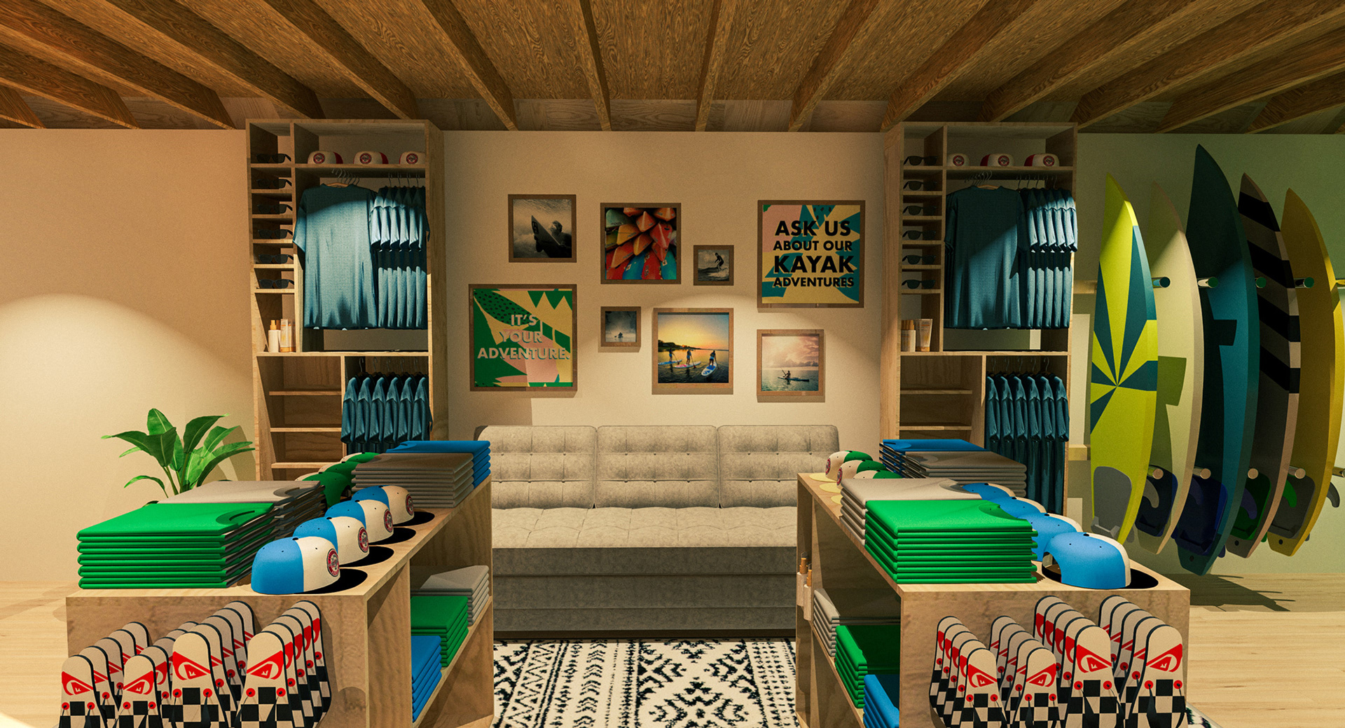
The shop is divided into 2 sections: Surf shop on the left, bike rental & repair shop on the right. We needed to provide space for casual shopping, but also leave enough room for large groups and families to come in and comfortably pick up their rentals, and kick-off their vacation in a relaxing environment.
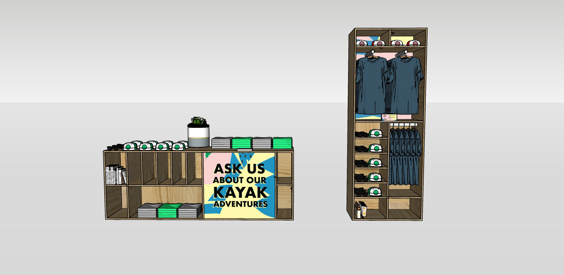
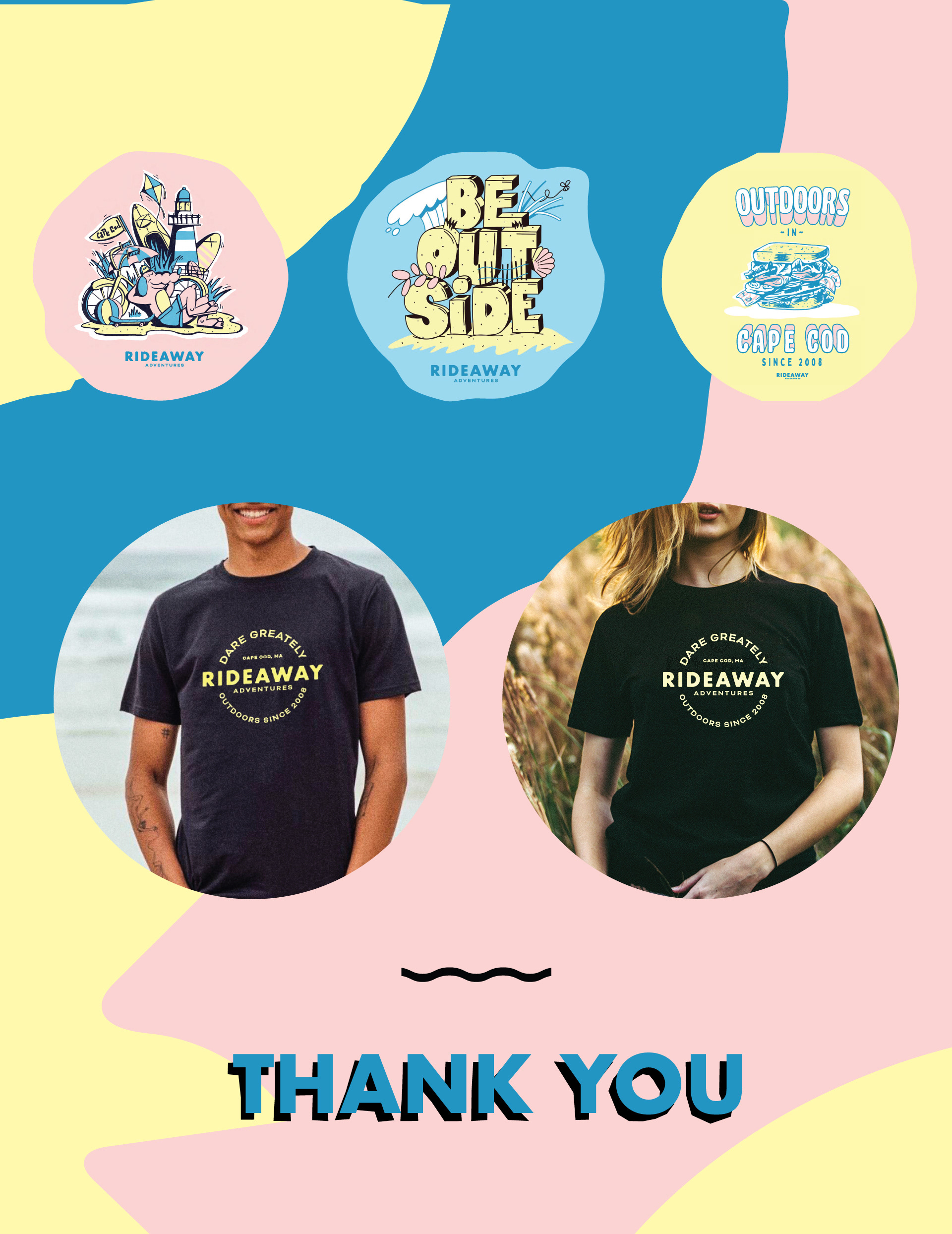
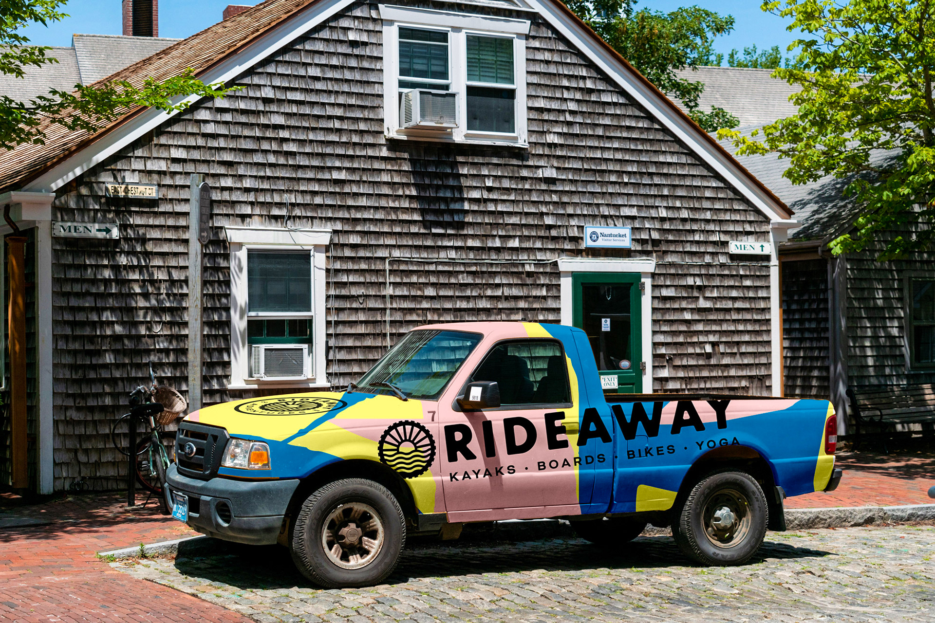
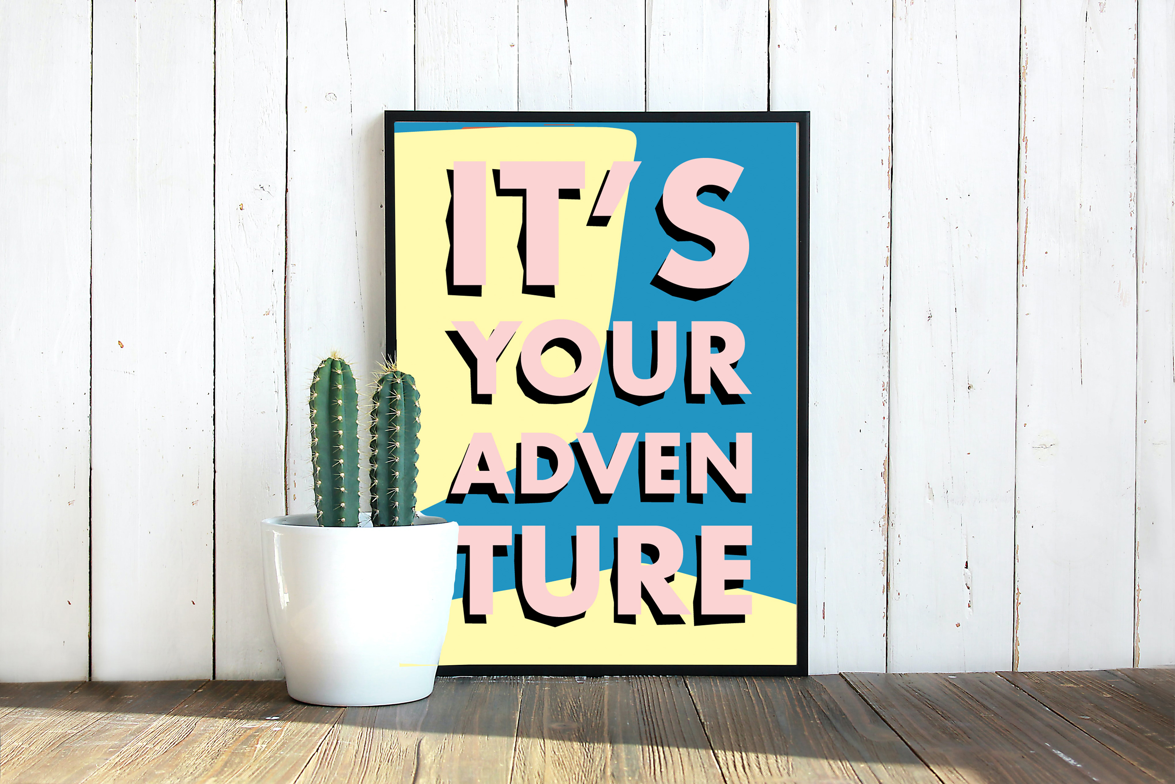
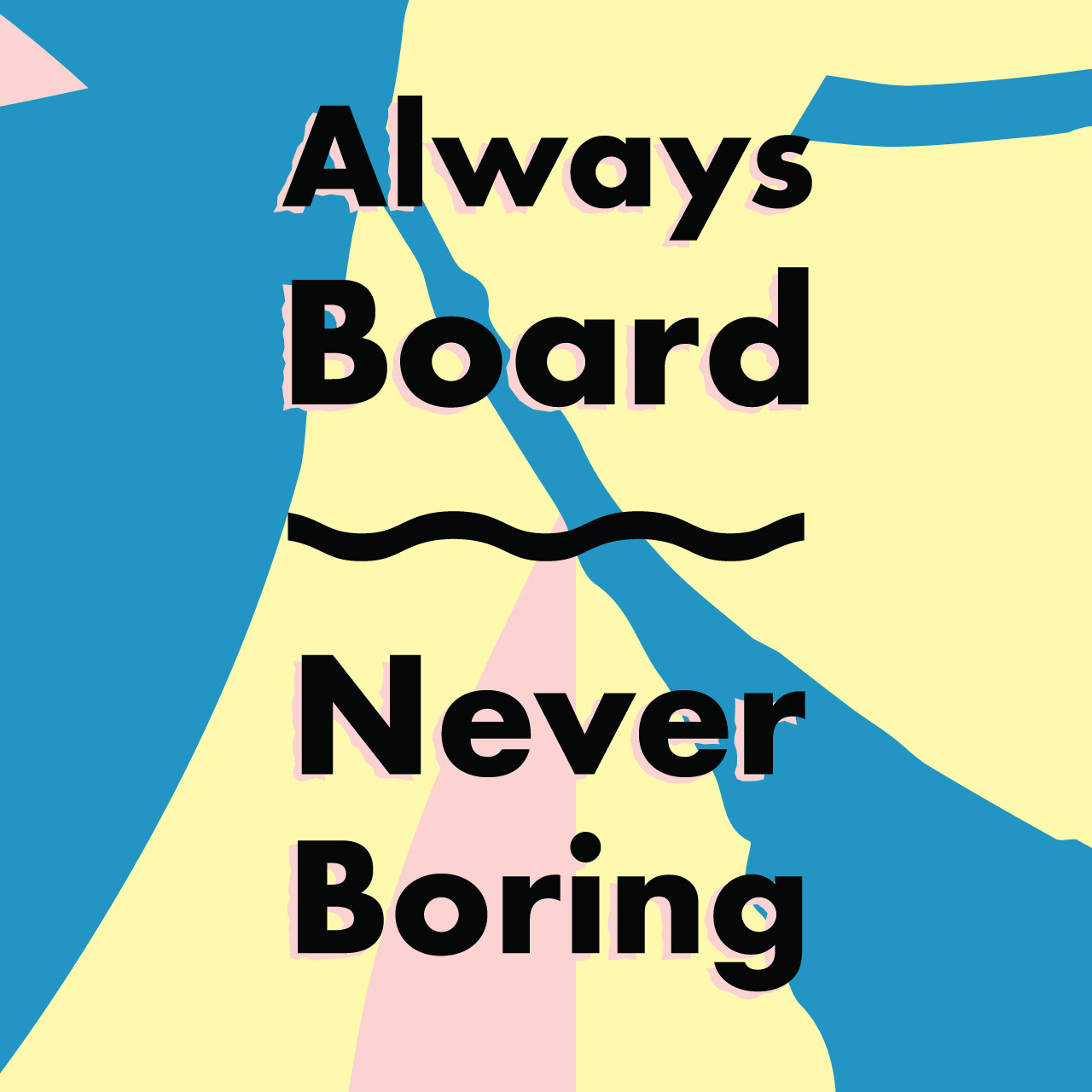
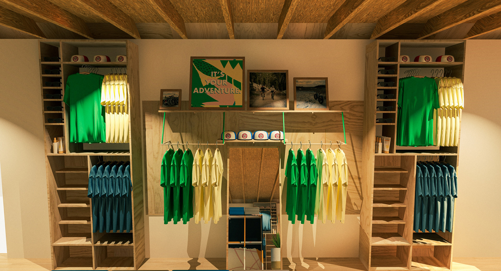
Custom Apparel
Can't have a surf shop without some custom gear! We created a series of Rideaway Adventures apparel, as well as a special collection with Adam Danielson, a Boston-based, Maine-bred independent graphic designer specializing in Brand Development & Illustration. Pulling from the brand research, we identified a few phrases and visual concepts that would live on as graphic tees.