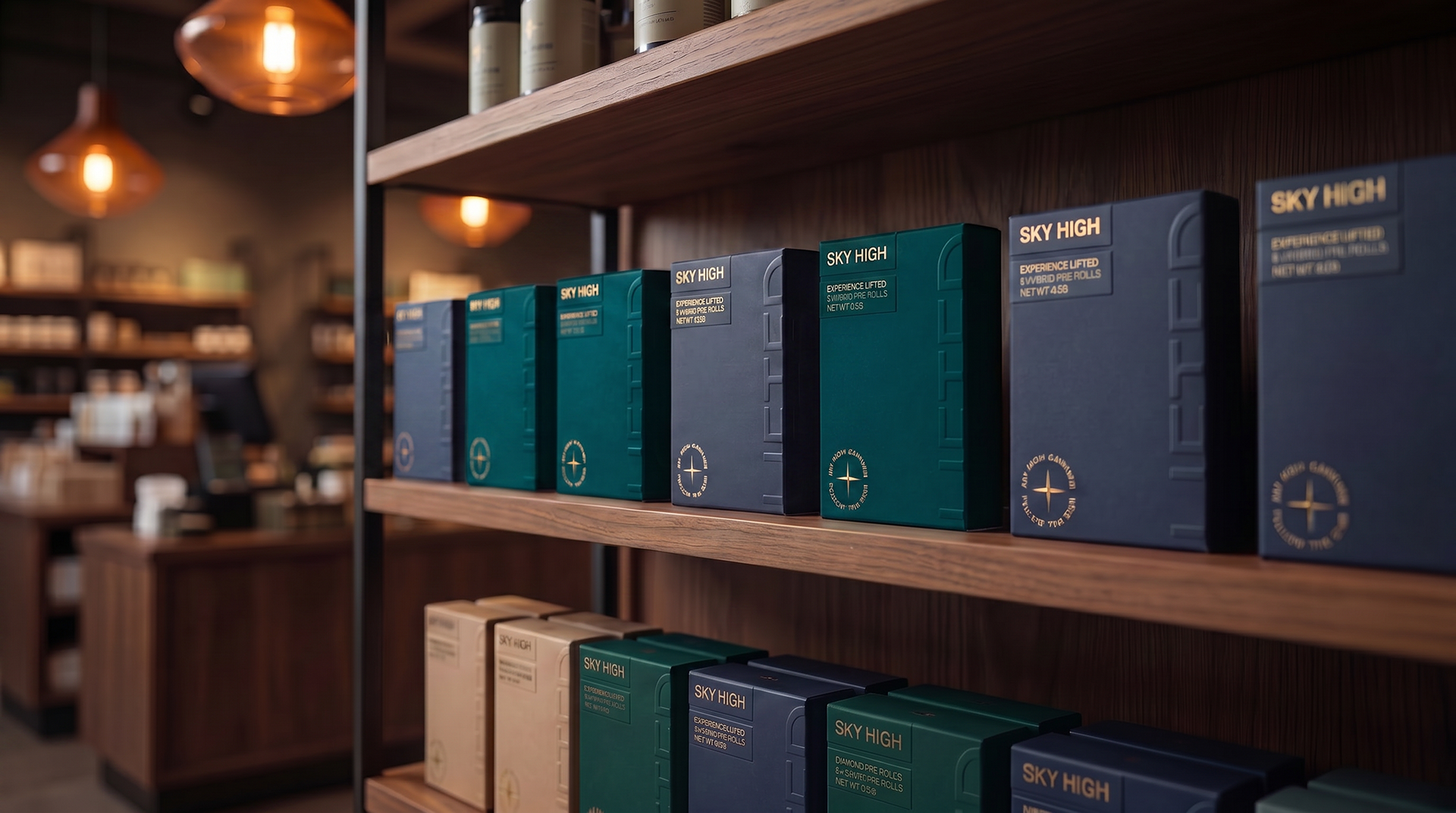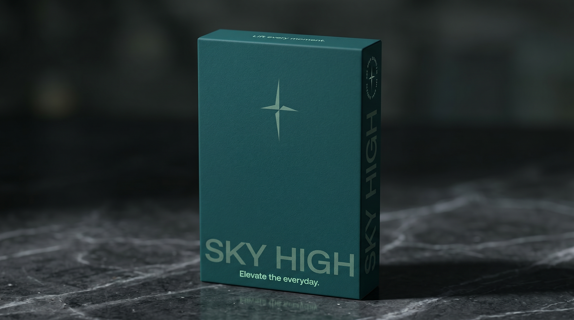
Objective: Rebrand a value cannabis brand to feel premium at a lower price point, with an identity that stands out on shelves crowded with apothecary labels and forgettable names.
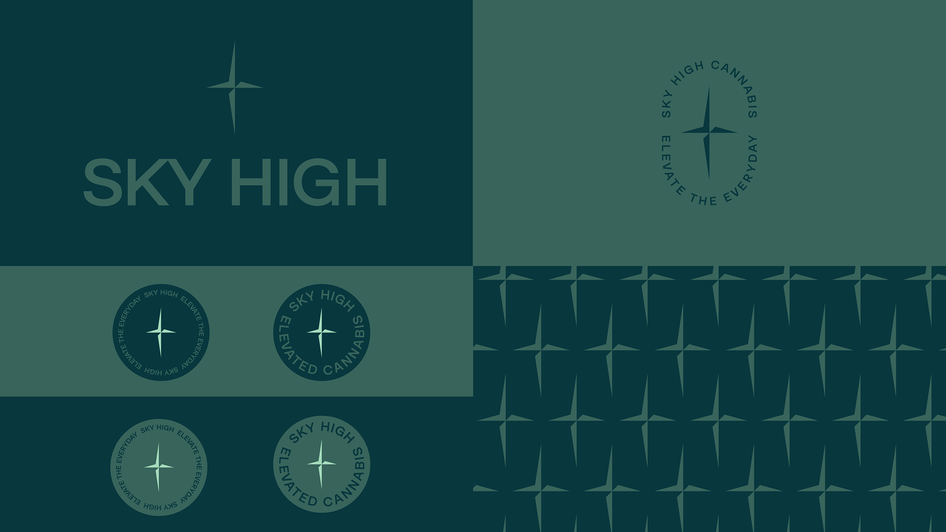
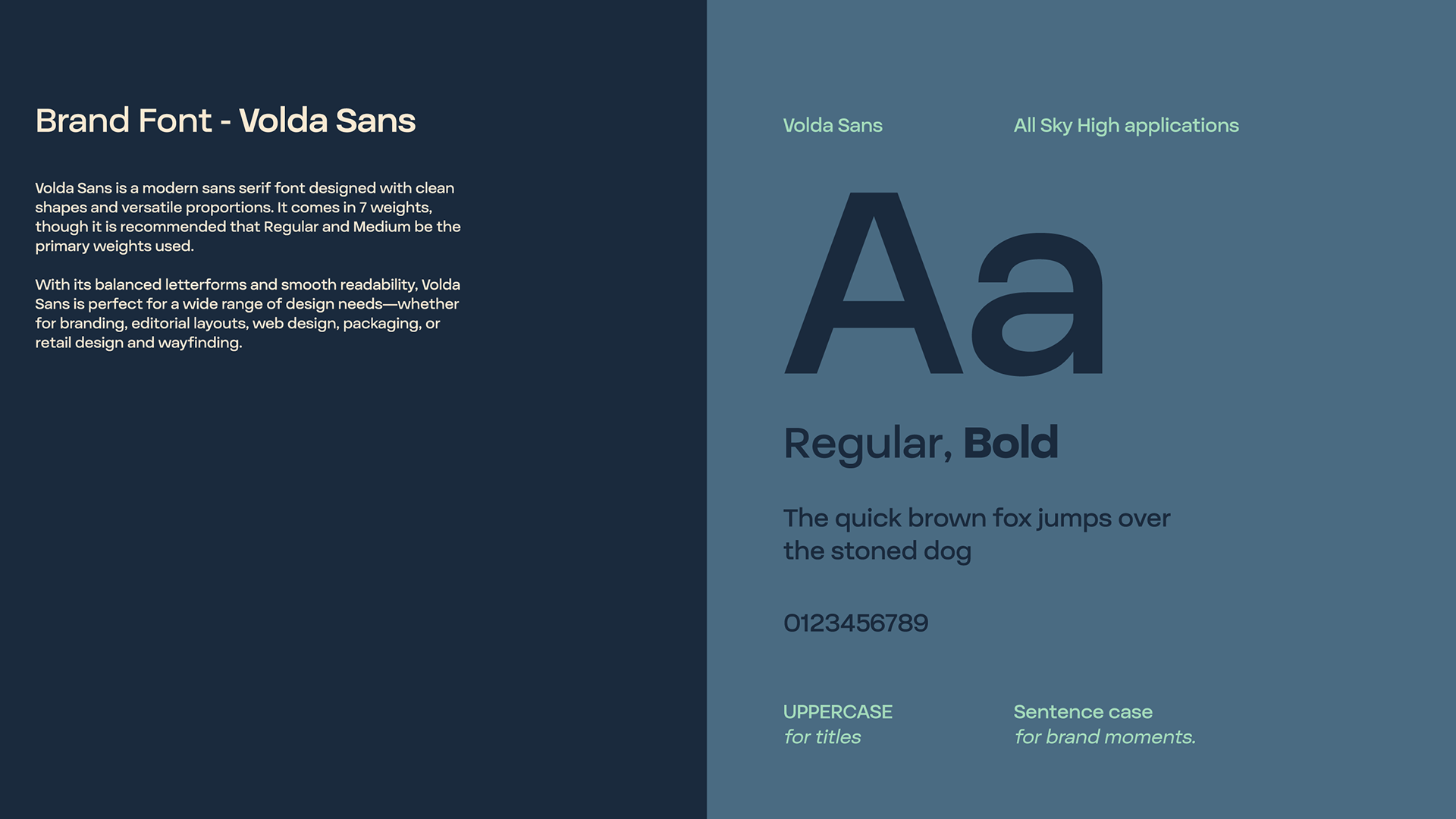
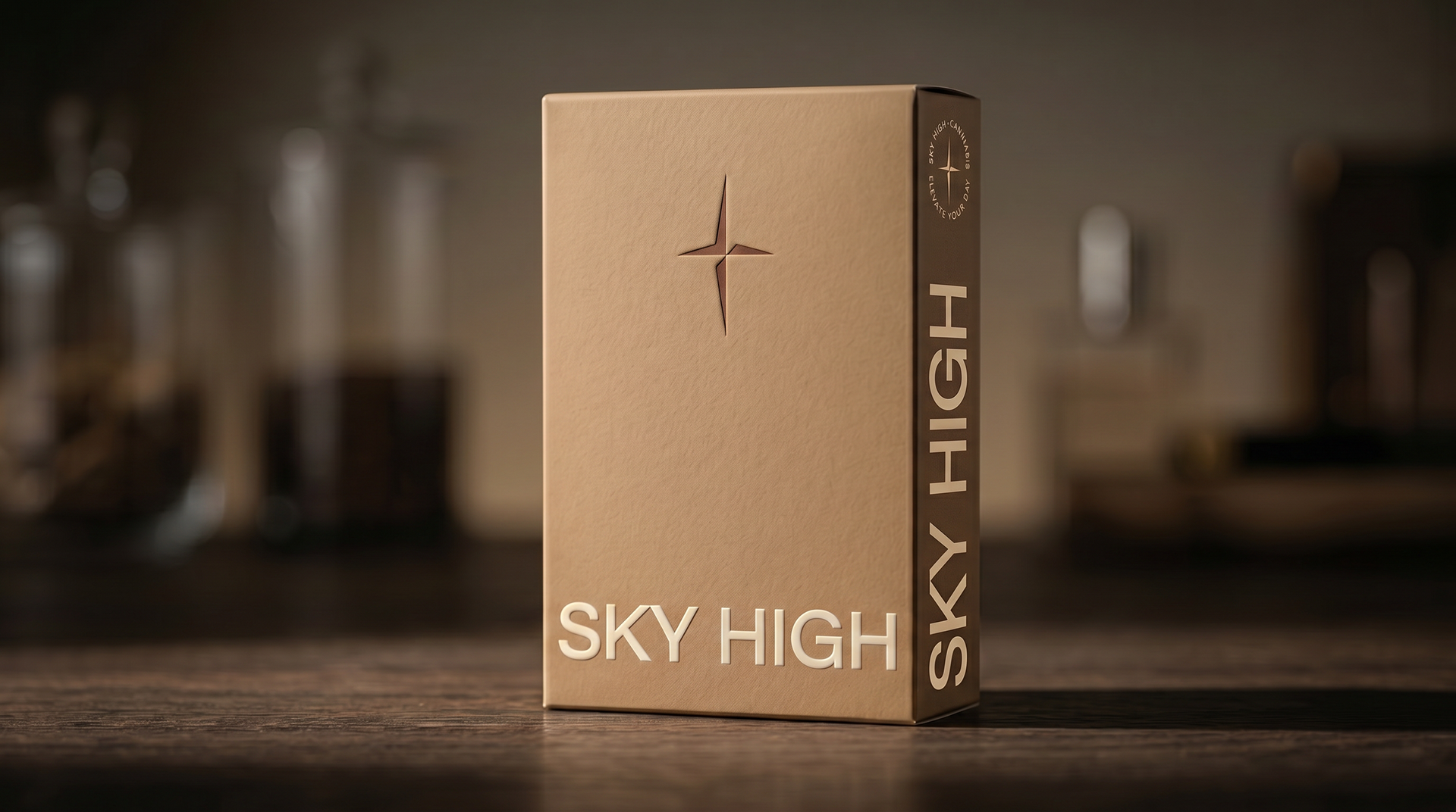
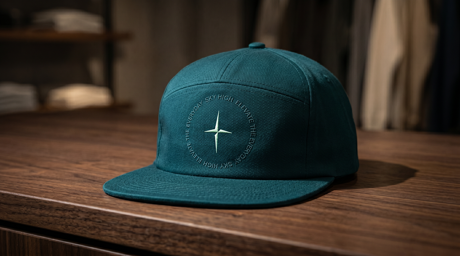
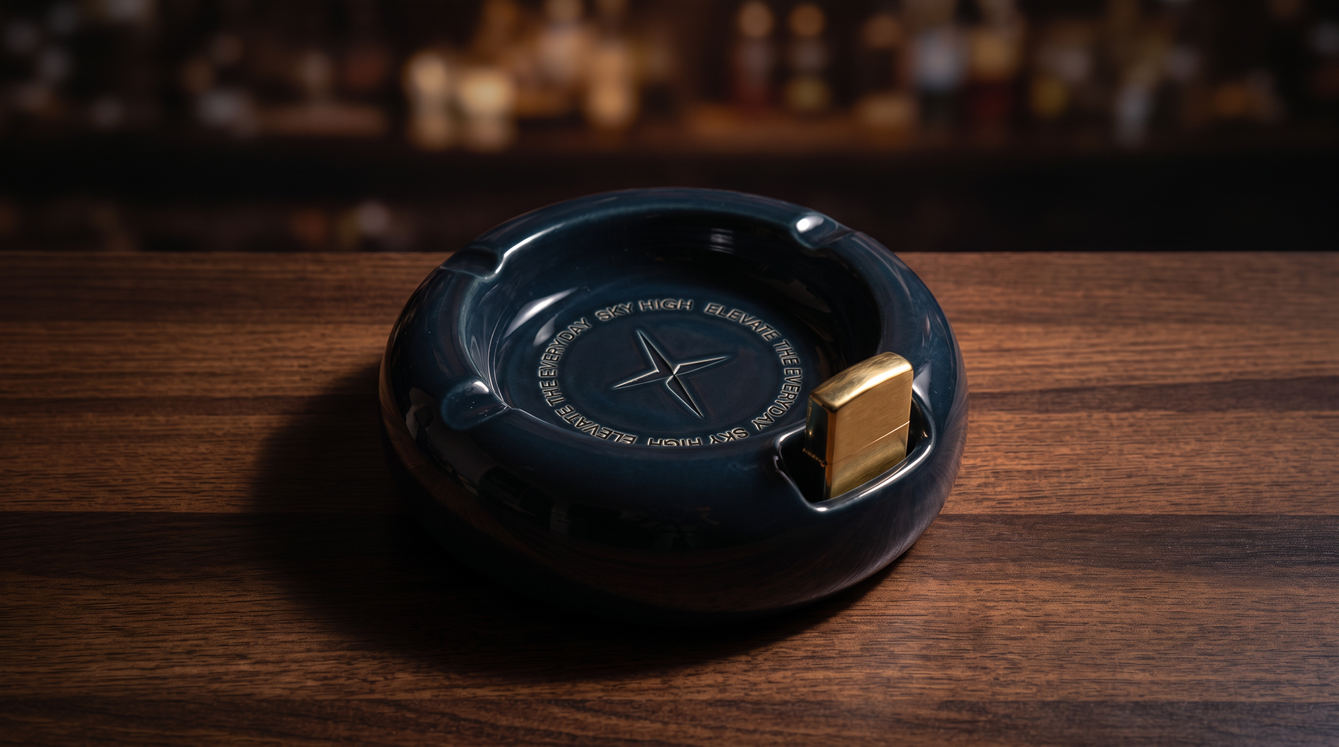
My role / contribution: Led positioning, identity, and packaging. I developed four concept directions with the founders, merged the strongest two, and built a system around a four-point star mark, a bold sans-serif wordmark, and a restrained palette. I wrote the "Elevate the Everyday" positioning and extended the system across packaging, vape hardware, and apparel.
Key highlight / impact: The icon works as a North Star, one simple mark that's easy to spot on a crowded shelf and scales from a jar label to a hat. It moved the brand from "budget" to an understated, dependable everyday choice.
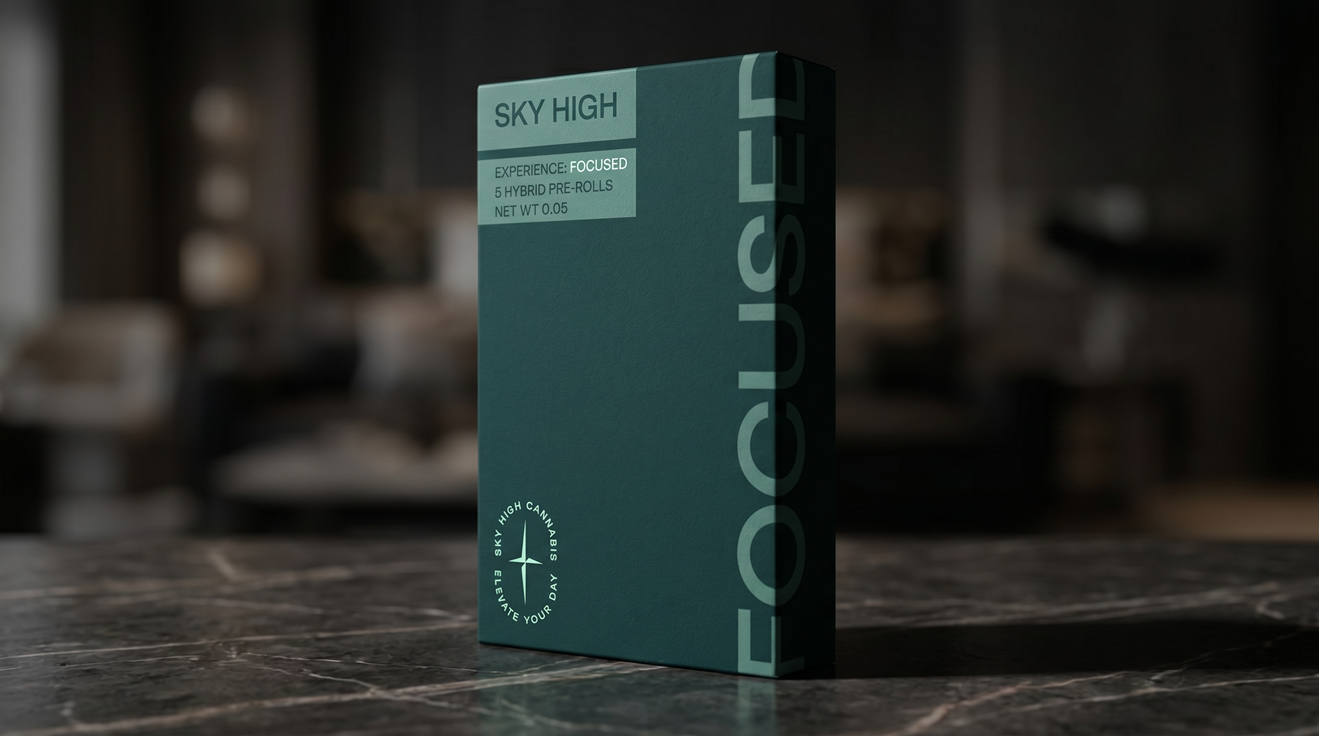
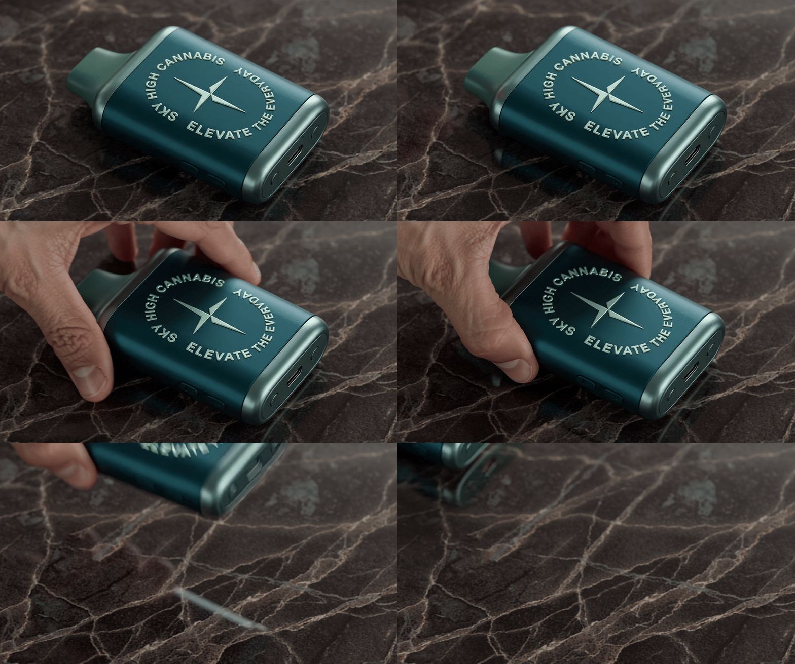
Cannabis got noisy. Too many brands, labels and names you can't remember the next time you go to purchase. Sky High is the clear signal: one star, easy to spot on any shelf, guiding you to a premium experience, priced for everyday.
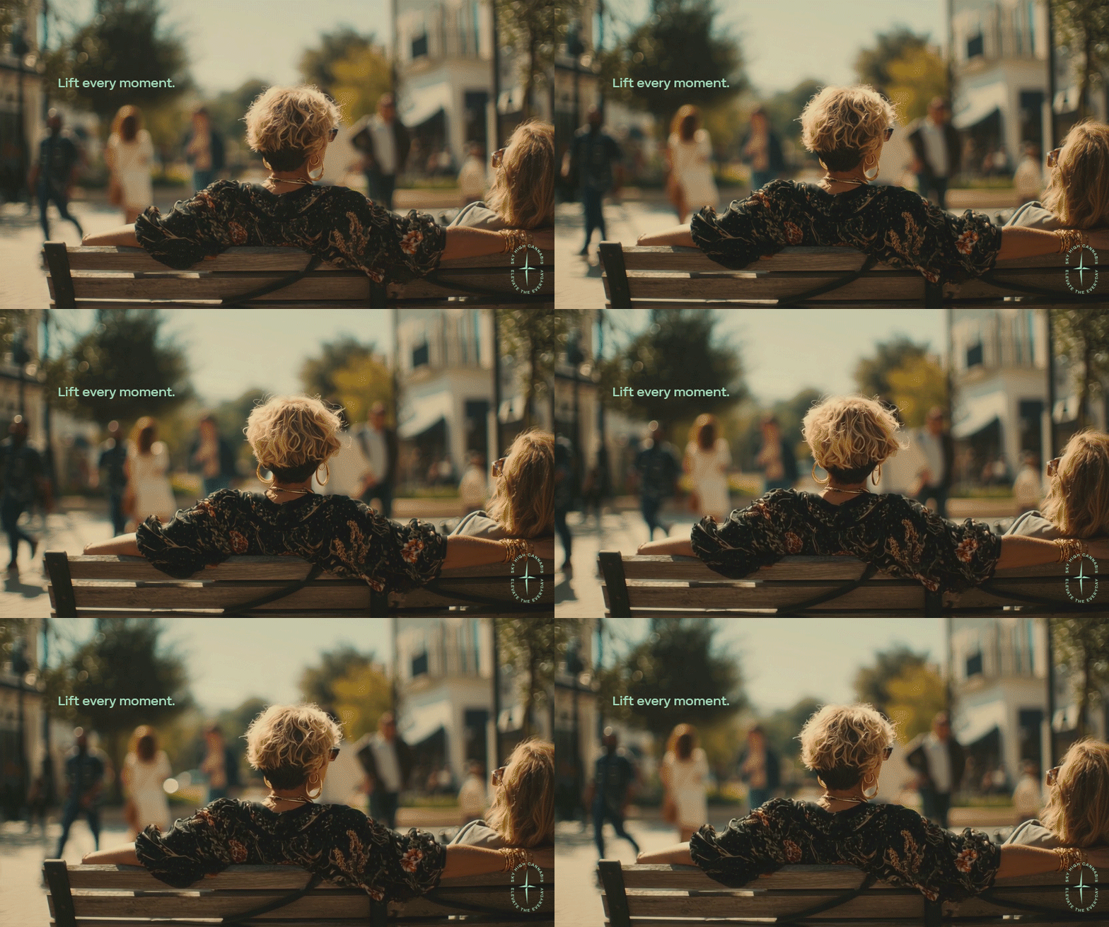
Made to lift every moment.
Made to lift every moment.